JÜZ
Ethno teahouse — logotype, brandbook and print — Almaty, 2025
JÜZ, Almaty
Logotype, brandbook, printed matter
2025
Ethno teahouse

Context
JÜZ is a restaurant gathering the culinary and cultural traditions of Turkic peoples. The name reads two ways: jüz means both a hundred and a zhuz, a tribal union. The descriptor changed over time — first ethno teahouse, later kazakh cuisine; the mark carried both without a redraw.
In use
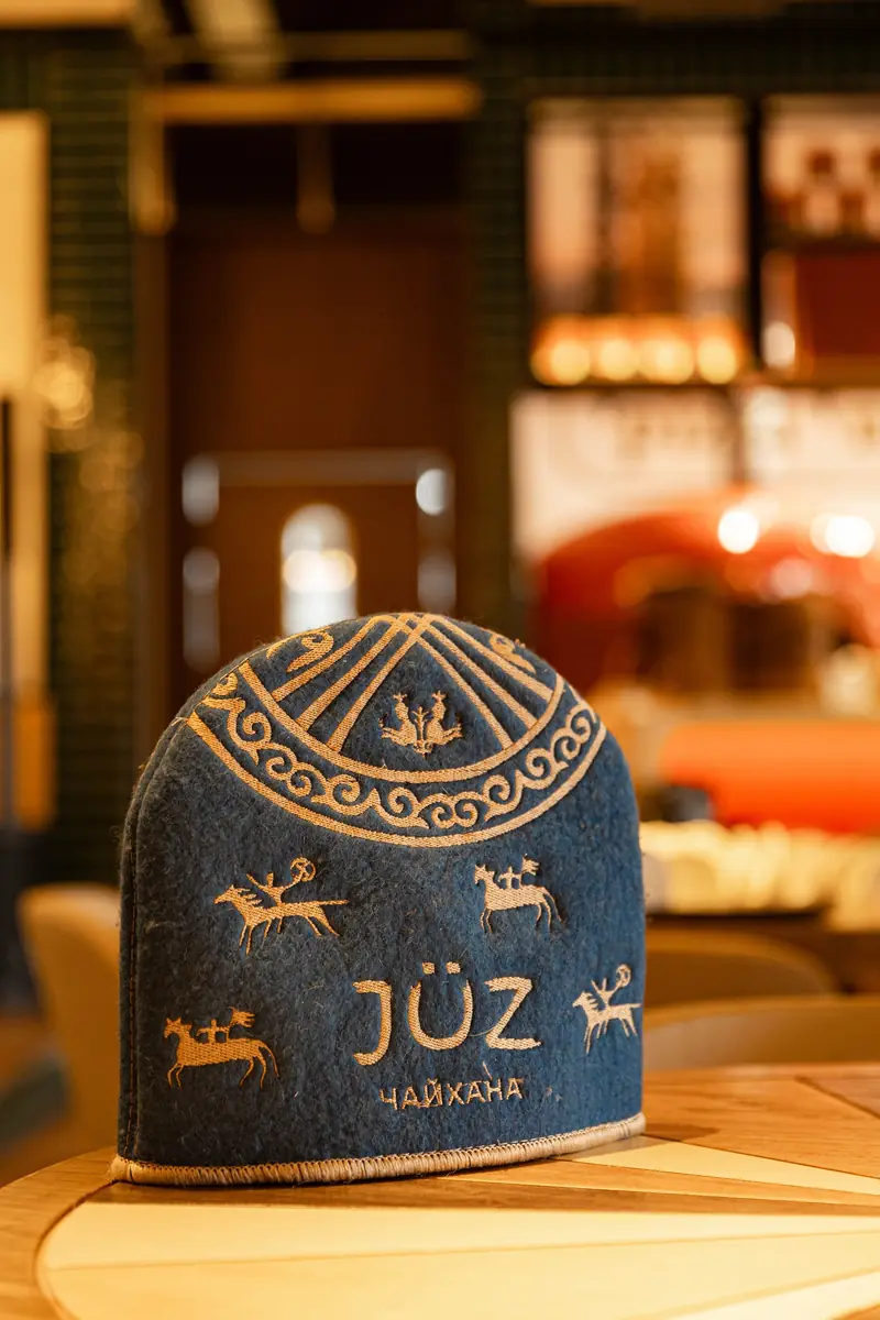
The venue's own photography. The ornament moved onto walls, textiles and tableware, while the name stayed on the things a guest picks up: the table stand, the box, the napkin. On the ceramics the mark sits with the rider and the ornamental band — the same set of elements as in the brandbook.




My role
Logotype and its versions, a 43-page brandbook, the pattern, menu and menu cover, postcards, bill folder, parchment, felt covers, signage and wayfinding plates.
Idea
A Latin umlaut and a Kazakh ornament in one system. The mark is set in a soft serif with a written stress — it doesn't argue with the pattern, it holds it: the ornament moves to the margins, the name stays clean.
System
Three lockups: the full one with the rider, a middle one with the descriptor, and the short name alone. The pattern is built from the same curl as the ornament on the walls and exists in four colourways so it never fights the interior.


Type — Gotham Pro, Nunito Sans, and Maestro for accents.
Menu, cover, postcards, bill folder and parchment. The ornament always works as a frame rather than a fill: it holds the margin and leaves air for the text.


