Hooqa
Coffee by day, chill out bar by night — logotype and print — Bishkek, 2026
Hooqa, Bishkek
Logotype, menus, posters, uniform, POS
2026
One brand, two faces

Context
Hooqa runs in two modes. By day it is Hooqa Coffee: a garden, a fountain, blue porcelain, breakfast on the veranda. By night it becomes Hooqa Room, a chill out bar with shisha, a dark room and board games. One owner, one name, two completely different audiences.
Where it lives
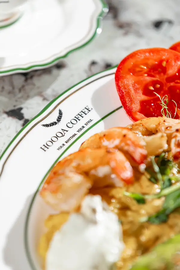
Hooqa Coffee is a garden with a fountain, bougainvillea and blue porcelain with the mark drawn thin around the rim. By day the brand sounds nothing like it does at night — that was the condition, not the problem.




My part
The logotype for both formats and all the print: A3 and A5 menus, the shisha list, posters, vouchers, the facade banner, staff uniform, POS. Plus the Game Playbook — the format and the design are mine.
Idea
One mark for two times of day. A laurel wreath and a high-contrast serif carry the evening; by day the same mark thins to a hairline on porcelain and stops competing with the garden.
System
Gold on black for the evening. A hairline on pale stock for the day. The A3 menu exists in two versions, cream and burgundy, to suit the light in the room at different hours. The leaf pattern echoes the wreath in the logo.
The gold is foiled on physical items and runs as a gradient on screen.
The mark
A wreath and a didone. The name exists in two versions — short HOOQA and full HOOQA COFFEE — and in three treatments: solid, reversed, and tonal, where the wreath drops to a half-tone and stops competing with the letterforms. The descriptor is set in letterspaced sans: it anchors the bottom of the lockup without fighting the serif above it.


