Qant
Pâtisserie — logotype, brandbook and packaging — Bishkek, 2025
Qant Pâtisserie, Bishkek
Logotype, brandbook, packaging, print
2025
Pâtisserie with a terrace

Context
Qant is a pâtisserie in Bishkek: hand-made chocolate, cakes, macarons, marshmallow, dragées. The descriptor runs in Kyrgyz — "кондитердик үй", a house of confectionery. The venue has a large summer terrace, and the brand had to sit as well on a box of chocolates as on the awning above the tables.
Where it lives
A summer terrace under striped awnings, cream walls, greenery. The brand palette came out of this room: mint and olive from the terrace, burgundy and peach from the counter.


My part
The logotype, a 34-page brandbook, and all the packaging and print: bags, boxes for chocolates and cookies, cups, stickers, coasters.
Idea
A pâtisserie as a jeweller's shop. The mark is built as an engraved cartouche — a scrolled frame with the name and the year inside. A mark like that belongs equally on gold foil and on kraft board.
System
The cartouche exists in four colours: burgundy, mint, olive and peach. Colour is assigned to a product line rather than to an occasion, so the shelf reads as one set instead of a jumble. Type is STIX Two Text for the name and TT Interphases Pro for everything else.

One background throughout — warm cream #F9F1E6.
In use
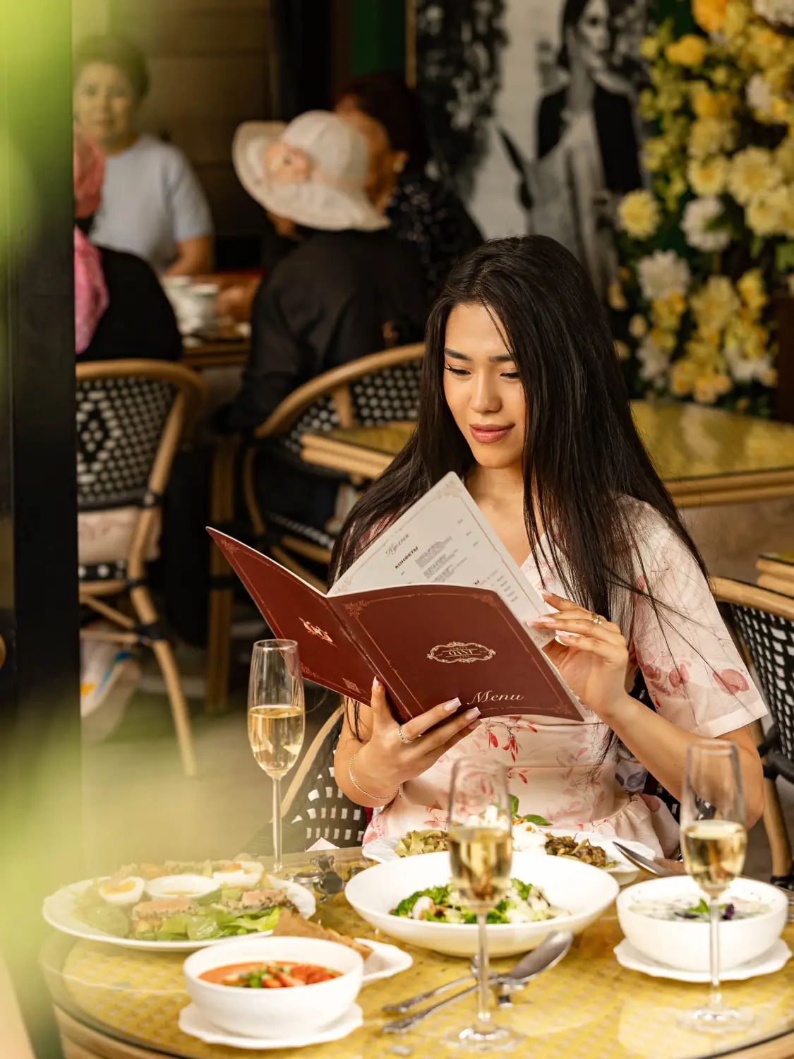
The photography is the venue’s, not mine. I show it as evidence that the system holds: the menu in a guest’s hands, the cartouche over the entrance arch, boxes and bag at collection. Some items in these frames appeared after I stopped running the project — built on the system I left behind.



Packaging
Chocolate boxes in two sizes, a cookie box, bags in two formats, coffee cups, stickers and coasters. Every item exists in all four colours of the system.


Brandbook
Thirty-four pages: the mark and its versions, palette, type, the full product range by category, branded goods and photography of the place. A document the brand can be run from without me.