Panaderia
Bakery and bistro — logotype, identity, packaging — Almaty, 2024
Restaurant group, Almaty
Logotype, identity, packaging, print
June 2024 — March 2025
Bakery and bistro, single venue

Context
Panaderia is Spanish for bakery. A bakery and bistro on Abylay Khan Avenue: comfort food cooked over live fire, a wood oven and a josper. Part of a restaurant group running several venues in different formats. The client arrived with a finished concept and positioning — but no visual language.


Environment
Dimensional letters on the facade — graphite by day, lit at night. Inside, the wordmark repeats in coral on the wall above the wood oven, right where the baking happens. From there the mark moves into the display case and onto the packaging standing in it.


In the wild
Comfort food over live fire: a wood oven and a josper. Baking in the morning, bistro through the day — the takeaway packaging worked every hour the doors were open.


My part
The direction came from the client. The logotype, the type system, the palette and every application — from the business card to the takeaway packaging — I drew myself.
Idea
A bakery, not a restaurant. The mark looks drawn by hand: uneven contour, live strokes. Warm coral on beige paper instead of restaurant black.
System
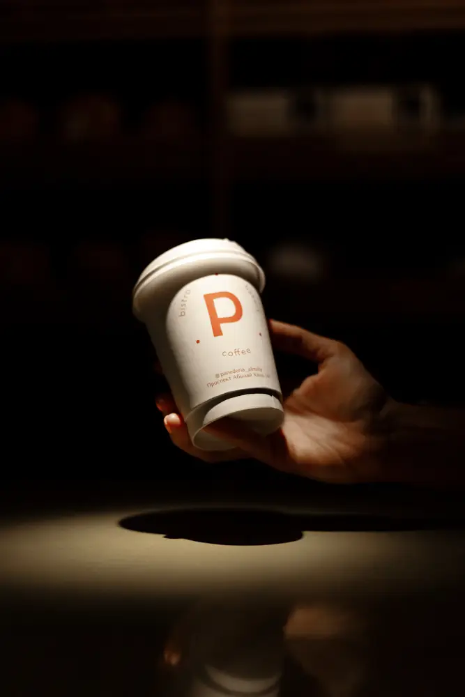
The logotype lives in two states. The horizontal wordmark carries the large surfaces — signage, bags, the shopfront. The round P seal handles the small ones — cups, stickers, the back of a card. All of it rests on two colours.


In print both colours are built from two inks: M70 and Y70.
Applications
All takeaway packaging was printed in two inks. That kept the run affordable and held the same colour across board, kraft and cup stock. CMYK was reserved for the one box that carries a photograph.




- Business card 85 × 55 mm
- 350 ml cup
- Two-cup coffee carrier
- Dessert box
- Boxes 195 × 115 × 63 and 238 × 197 × 79 mm
- Bags 100 × 400 × 80, 170 × 150 × 80, 300 × 400 × 60 mm
1,000 units of each.